Business Challenge
The platform suffered from inconsistent visual elements and unclear user flows, which reduced engagement across course pages. Navigation friction and weak content hierarchy made it difficult for learners to identify programs aligned with their goals.
Web designing intervention was required to modernize the interface, streamline navigation, and improve clarity across the enrollment journey.

Objectives and Success Metrics
The focus was to create a structured, conversion-ready interface that improves usability and drives measurable enrollment actions.
- Improve clarity across course navigation and hierarchy
- Increase engagement across program and landing pages
- Reduce bounce rates through improved UX flow
- Increase enquiry and enrollment conversions
Engagement Growth
Conversion Lift
UX Efficiency
Session Quality
Strategic Approach
We restructured the digital experience around learner intent, visual clarity, and action-oriented design principles.

UX restructuring
Redesigned navigation and content hierarchy for logical progression

Visual consistency
Standardized design elements across courses and landing pages

Conversion alignment
Integrated clear CTAs aligned with enrollment decision stages
Implementation Highlights
- Complete UI/UX audit and journey mapping
- Redesign of homepage and core course landing pages
- Clear program categorization and filtering structure
- Improved typography, layout hierarchy, and visual clarity
- Mobile-first optimization for improved accessibility
- CTA repositioning to support enrollment flow
Challenges and Resolutions
Outcome
Challenge
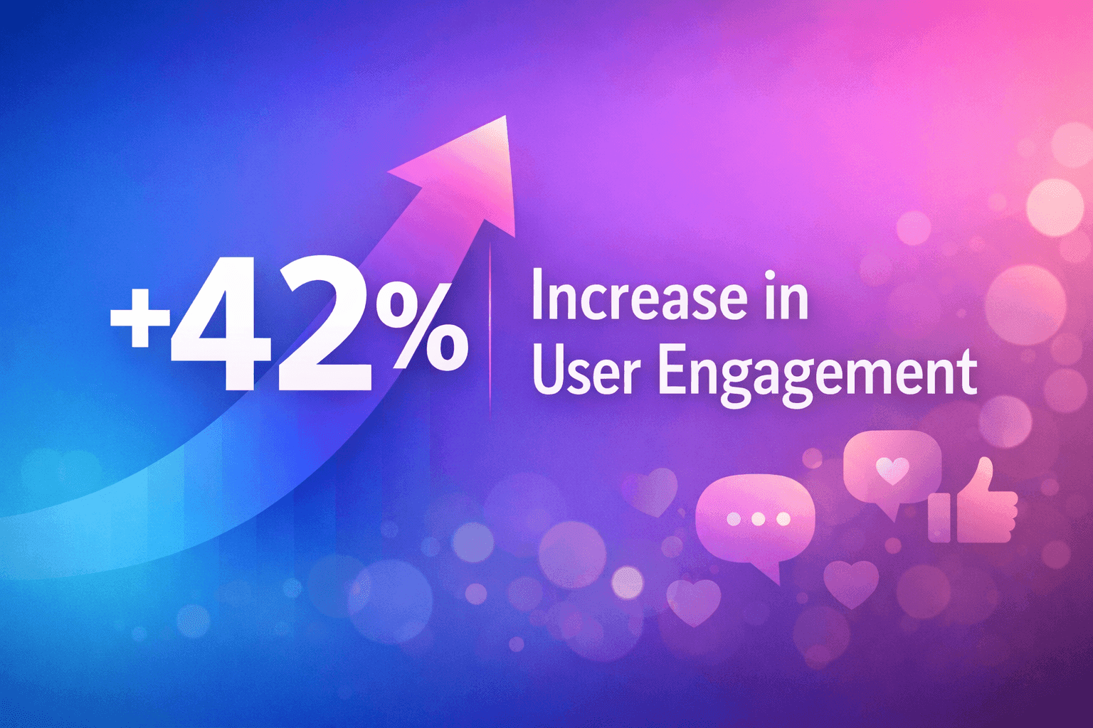
Inconsistent design reducing credibility
Resolution
Implemented unified visual and brand system
Result
42% increase in engagement
Outcome
Challenge
Unclear user journey impacting conversions
Resolution
Simplified navigation and course pathways
Result
36% increase in enquiries
Outcome
Challenge
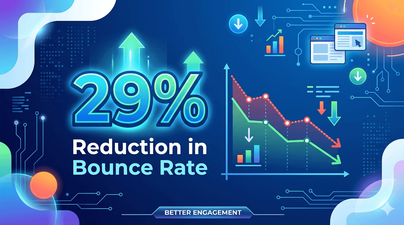
High bounce rates on key pages
Resolution
Improved layout clarity and call-to-action visibility
Result
29% reduction in bounce rate
Results and Business Impact
Why This Worked
Performance improved because the platform was redesigned around learner decision behavior rather than static content layout.
Navigation aligned with course discovery patterns
Visual clarity improved trust and credibility
Conversion pathways structured around enrollment actions
Build a Scalable Growth System